6.3 Bread
The owner of a bakery, worried about the excessive variability of his products’ weight, decided to carry out a study in order to analyze the distribution of the weight of one of his breads. The bread is elaborated by two operators (A and B) using two different machines (1 and 2). Both operators do not work simultaneously: the days A works, B does not and vice versa. For the study, daily samples of four pieces of bread of each machine were taken throughout a period of 20 days. The data obtained are included in file BREAD.MTW.
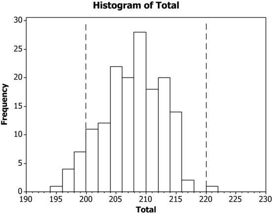
The nominal weight of the pieces of bread is 210 grams, but a variation of ± 10 grams is accepted. Which conclusions can be drawn from these data? Which recommendations would you give the owner of the bakery?
First of all, make a histogram of all data. For this, we have to pile all data in a single column.
Data > Stack > Columns
Graph > Histogram: Simple
Graph variables: Total. The aspect of the graph has been changed adding two lines that show the tolerance limits. This has been done using the toolbar: Tools > Toolbars > Graph Annotation Tools
The distribution is left-skewed, with a certain percentage out of tolerances. Let us have a closer look stratifying by machine.
Put the values of Machine 1 in one column (Data > Stack > Columns for ...