October 2012
Beginner
420 pages
9h 37m
English
6.4 Humidity
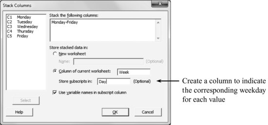
There are several options to analyze these data graphically. An appropriate graph to represent the weekly evolution of the humidity is a time series plot. To construct it, the data must first be stacked in a single column.
To pile up the data, proceed as usual: Data > Stack > Columns
Time series diagram of the variable ‘Week’.
Graph > Time Series Plot: Simple. Series: Week

The shown process is not stable: there is first an increasing trend followed by a sudden jump downwards. To distinguish the weekdays, different line types and colors can be used. To do so, double-click on the line. A dialog box that allows you to edit the lines appears:

Notice that, by ...
Read now
Unlock full access


