Skip to Content
For Enterprise
For Government
For Higher Ed
For Individuals
For Marketing
For Enterprise
For Government
For Higher Ed
For Individuals
For Marketing
Explore Skills
Cloud Computing
Microsoft Azure
Amazon Web Services (AWS)
Google Cloud
Cloud Migration
Cloud Deployment
Cloud Platforms
Data Engineering
Data Warehouse
SQL
Apache Spark
Microsoft SQL Server
MySQL
Kafka
Data Lake
Streaming & Messaging
NoSQL Databases
Relational Databases
Data Science
Pandas
R
MATLAB
SAS
D3
Power BI
Tableau
Statistics
Exploratory Data Analysis
Data Visualization
AI & ML
Generative AI
Machine Learning
Artificial Intelligence (AI)
Deep Learning
Reinforcement Learning
Natural Language Processing
TensorFlow
Scikit-Learn
Hyperparameter Tuning
MLOps
Programming Languages
Java
JavaScript
Spring
Python
Go
C#
C++
C
Swift
Rust
Functional Programming
Software Architecture
Object-Oriented
Distributed Systems
Domain-Driven Design
Architectural Patterns
IT/Ops
Kubernetes
Docker
GitHub
Terraform
Continuous Delivery
Continuous Integration
Database Administration
Computer Networking
Operating Systems
IT Certifications
Security
Network Security
Application Security
Incident Response
Zero Trust Model
Disaster Recovery
Penetration Testing / Ethical Hacking
Governance
Malware
Security Architecture
Security Engineering
Security Certifications
Design
Web Design
Graphic Design
Interaction Design
Film & Video
User Experience (UX)
Design Process
Design Tools
Business
Agile
Project Management
Product Management
Marketing
Human Resources
Finance
Team Management
Business Strategy
Digital Transformation
Organizational Leadership
Soft Skills
Professional Communication
Emotional Intelligence
Presentation Skills
Innovation
Critical Thinking
Public Speaking
Collaboration
Personal Productivity
Confidence / Motivation
Features
All features
Verifiable skills
AI Academy
Courses
Certifications
Interactive learning
Live events
Superstreams
Answers
Insights reporting
Radar Blog
Buy Courses
Plans
Sign In
Try Now
O'Reilly Platform
book
Pythonデータサイエンスハンドブック ―Jupyter、NumPy、pandas、Matplotlib、scikit-learnを使ったデータ分析、機械学習
by
Jake VanderPlas
,
菊池 彰
May 2018
Intermediate to advanced
556 pages
13h 21m
Japanese
O'Reilly Japan, Inc.
Content preview from
Pythonデータサイエンスハンドブック ―Jupyter、NumPy、pandas、Matplotlib、scikit-learnを使ったデータ分析、機械学習
238
4
章
Matplotlib
による可視化
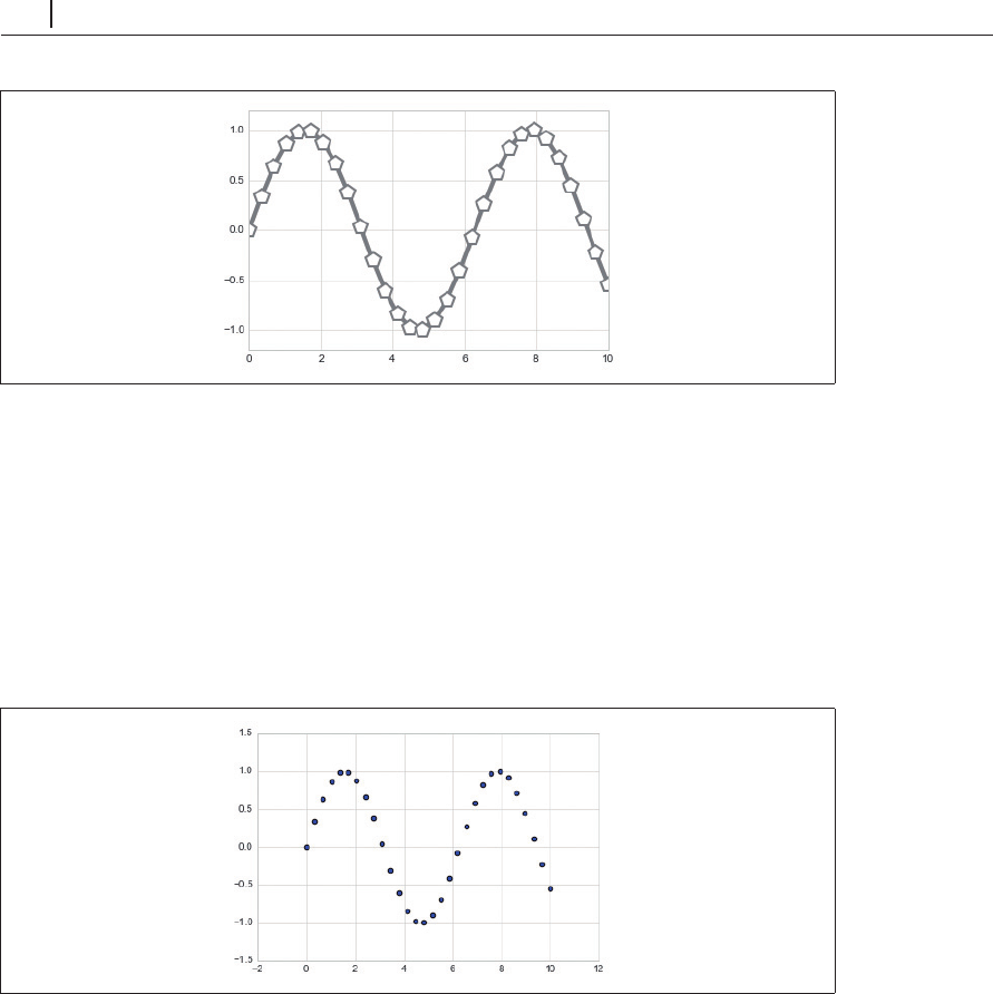
図4-23 線スタイルと点マーカーのカスタマイズ
plt.plot
関数の柔軟性により、さまざまな可視化オプションが利用可能です。使用可能なオプ
ションの詳細については、
plt.plot
のマニュアルを参照してください。
4.4.2
plt.scatter
を使った散布図
散布図を作成するためのさらに強力な方法は、
plt.scatter
関数を使うことです(
図
4-24
)。これ
は
plt.plot
関数と非常によく似ています。
In[6]: plt.scatter(x, y, marker='o');
図4-24 単純な散布図
plt.plot
との主な違いは、それぞれの点のプロパティ(サイズ、面の色、境界線の色など)を個
別に制御したり、データにマッピングできることです。
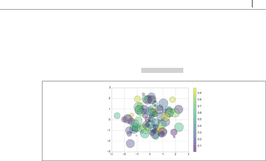
これを使って、さまざまな色と大きさを持つランダムな点の散布図を作成してみましょう。重な
り合った点をよりよく表示するために、
alpha
キーワードを使用して透過レベルを調整します(
図
4-25
)。
In[7]: rng = np.random.RandomState(0)
4.4
単純な散布図
239
x = rng.randn(100)
y = rng.randn(100)
colors = rng.rand(100) ...
Become an O’Reilly member and get unlimited access to this title plus top books and audiobooks from O’Reilly and nearly 200 top publishers, thousands of courses curated by job role, 150+ live events each month,
and much more.
Start your free trial
You might also like
Pythonデータサイエンスハンドブック 第2版 ―Jupyter、NumPy、pandas、Matplotlib、scikit-learnを使ったデータ分析、機械学習
Jake VanderPlas, 菊池 彰
Pythonではじめる機械学習 ―scikit-learnで学ぶ特徴量エンジニアリングと機械学習の基礎
Andreas C. Muller, Sarah Guido, 中田 秀基
PythonによるAIプログラミング入門 ―ディープラーニングを始める前に身につけておくべき15の基礎技術
Prateek Joshi, 相川 愛三
初めてのGraphQL ―Webサービスを作って学ぶ新世代API
Eve Porcello, Alex Banks, 尾崎 沙耶, あんどうやすし
Publisher Resources
ISBN: 9784873118413
Other