Skip to Content
Pythonデータサイエンスハンドブック ―Jupyter、NumPy、pandas、Matplotlib、scikit-learnを使ったデータ分析、機械学習
book

Pythonデータサイエンスハンドブック ―Jupyter、NumPy、pandas、Matplotlib、scikit-learnを使ったデータ分析、機械学習

by Jake VanderPlas, 菊池 彰
May 2018
Intermediate to advanced
556 pages
13h 21m
Japanese
O'Reilly Japan, Inc.
Content preview from Pythonデータサイエンスハンドブック ―Jupyter、NumPy、pandas、Matplotlib、scikit-learnを使ったデータ分析、機械学習
268
4
章 
Matplotlib
による可視化
縦に重なる
2
つの軸(上の軸には、
x
軸の目盛のラベルがない)が作成されます。上の図の下端(
0.5
の位置)は下のパネルの上端(
0.1
0.4
の位置)と一致します。
4.10.2
plt.subplot
:サブプロットの単純なグリッド
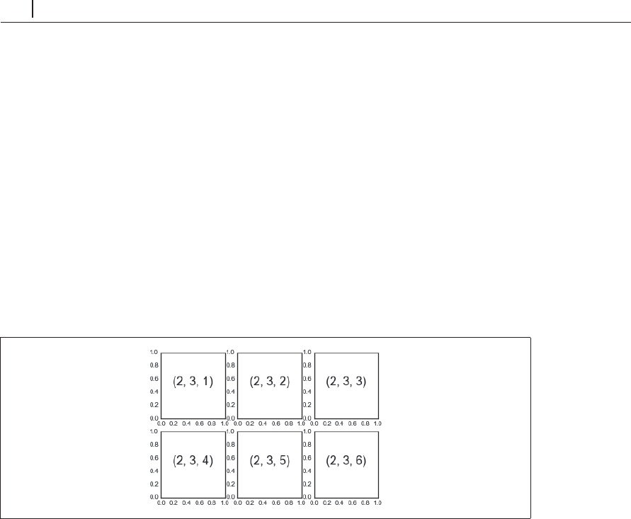
列または行で整列したサブプロットの集合は非常に一般的なので、こうした図を簡単に作成する
ための便利なメソッドを
Matplotlib
が提供するのには十分な理由があります。このための低レベル
インターフェースが
plt.subplot()
です。グリッド内に
1
つのサブプロットを作成します。例で示
すように、このメソッドは行の数、列の数、サブプロットのインデクス(左上から右下へ順に値を
割り当てる)の
3
つの引数を渡します( 4-61)。
In[4]: for i in range(1, 7):
plt.subplot(2, 3, i)
plt.tex
t(0.5, 0.5, str((2, 3, i)),
fontsize=18, ha='center')
図4-61 plt.subplot()の例
plt.subplots_adjust()
メソッドを使用して、これらのプロットの間隔を調整できます。次の
コード(その結果は図4-62を参照)は、オブジェクト指向インターフェースの等価なメソッドであ
fig.add_subplot()
を使用しています。
In[5]: fig = plt.figure()
fig.subplots_adjust(hspace=0.4, ...
Become an O’Reilly member and get unlimited access to this title plus top books and audiobooks from O’Reilly and nearly 200 top publishers, thousands of courses curated by job role, 150+ live events each month,
and much more.
Start your free trial

You might also like

Pythonデータサイエンスハンドブック 第2版 ―Jupyter、NumPy、pandas、Matplotlib、scikit-learnを使ったデータ分析、機械学習

Pythonデータサイエンスハンドブック 第2版 ―Jupyter、NumPy、pandas、Matplotlib、scikit-learnを使ったデータ分析、機械学習

Jake VanderPlas, 菊池 彰
初めてのGraphQL ―Webサービスを作って学ぶ新世代API

初めてのGraphQL ―Webサービスを作って学ぶ新世代API

Eve Porcello, Alex Banks, 尾崎 沙耶, あんどうやすし

Publisher Resources

ISBN: 9784873118413Other