Skip to Content
Pythonデータサイエンスハンドブック ―Jupyter、NumPy、pandas、Matplotlib、scikit-learnを使ったデータ分析、機械学習
book

Pythonデータサイエンスハンドブック ―Jupyter、NumPy、pandas、Matplotlib、scikit-learnを使ったデータ分析、機械学習

by Jake VanderPlas, 菊池 彰
May 2018
Intermediate to advanced
556 pages
13h 21m
Japanese
O'Reilly Japan, Inc.
Content preview from Pythonデータサイエンスハンドブック ―Jupyter、NumPy、pandas、Matplotlib、scikit-learnを使ったデータ分析、機械学習
272
4
章 
Matplotlib
による可視化
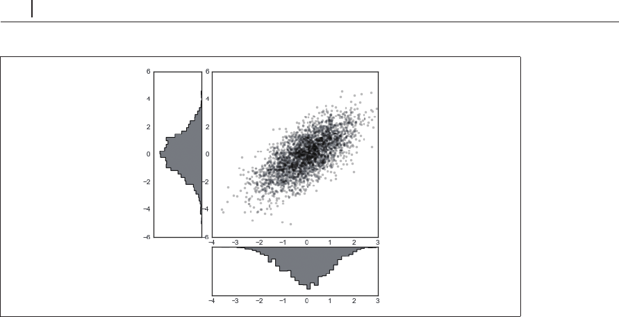
図4-66 plt.GridSpecを使用した多次元分布の可視化
余白に分布を描くこのタイプのプロットはよく使用されるため、
Seaborn
ライブラリに専用の
API
があります。詳細は、「4.16 Seaborn による可視化」を参照してください。
4.11
 テキストと注釈
優れた可視化では、図がストーリーを持ち、読み手を誘導します。こうしたストーリーはテキス
トを追加することなく視覚だけで伝えることも可能ですが、場合によってはちょっとしたテキスト
やラベルなどの手がかりが必要です。おそらく、最も基本的な注釈は軸ラベルとタイトルですが、
それ以外にもさまざまなオプションがあります。いくつかのデータを可視化し注釈を付けて、興味
深い情報を伝える方法を見てみましょう。まず、使用するモジュールをインポートして、
Jupyter
notebook
の設定を行います。
In[1]: %matplotlib inline
import matplotlib.pyplot as plt
import matplotlib as mpl
plt.style.use('seaborn-whitegrid')
import numpy as np
import pandas as pd
4.11.1
 事例:米国出生率における休日の影響
「3.10.4 事例:出生率データ」では、
1
年間の平均出生数をグラフにしました。既に述べたように、
この データは
https://raw.githubusercon ...
Become an O’Reilly member and get unlimited access to this title plus top books and audiobooks from O’Reilly and nearly 200 top publishers, thousands of courses curated by job role, 150+ live events each month,
and much more.
Start your free trial

You might also like

Pythonデータサイエンスハンドブック 第2版 ―Jupyter、NumPy、pandas、Matplotlib、scikit-learnを使ったデータ分析、機械学習

Pythonデータサイエンスハンドブック 第2版 ―Jupyter、NumPy、pandas、Matplotlib、scikit-learnを使ったデータ分析、機械学習

Jake VanderPlas, 菊池 彰
初めてのGraphQL ―Webサービスを作って学ぶ新世代API

初めてのGraphQL ―Webサービスを作って学ぶ新世代API

Eve Porcello, Alex Banks, 尾崎 沙耶, あんどうやすし

Publisher Resources

ISBN: 9784873118413Other