258
4
章
Matplotlib
による可視化
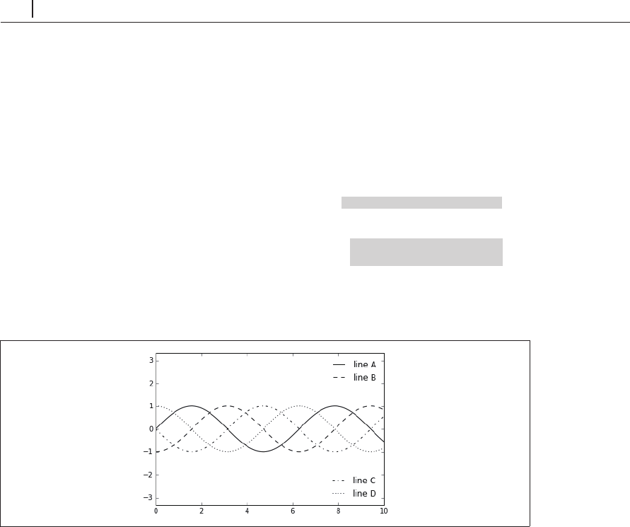
lines = []
styles = ['-', '--', '-.', ':']
x = np.linspace(0, 10, 1000)
for i in range(4):
lines += ax.plot(x, np.sin(x - i * np.pi / 2),
styles[i], color='black')
ax.axis('equal')
# specify the lines and labels of the first legend 1
つ目の凡例の行とラベルを指定する
ax.legend(lines[:2], ['line A', 'line B'],
loc='upper right', frameon=False)
# Create the second legend and add the artist manually.
2
つ目の凡例を生成し、その
artist
インスタンスを手動で追加する
from matplotlib.legend import Legend
leg = Legend(ax, lines[2:], ['line C', 'line D'],
loc='lower right', frameon=False)
ax.add_artist(leg);
図4-48 分割した凡例
ここでは、
Matplotlib
プロットを構成する低レベルの
artist
オブジェクトを使用しました。
ax.legend() ...