4.5
誤差の可視化
241
Mpc
*
1
であり、観測データからの推定は
74
±
5(km/s)/Mpc
となりました。これらの値は一貫して
いるでしょうか。それは定量的に答えられる質問です。
データと結果の可視化では、これらの誤差を効果的に表示することでもっと完全な情報を伝える
ことができます。
4.5.1
基本的なエラーバー
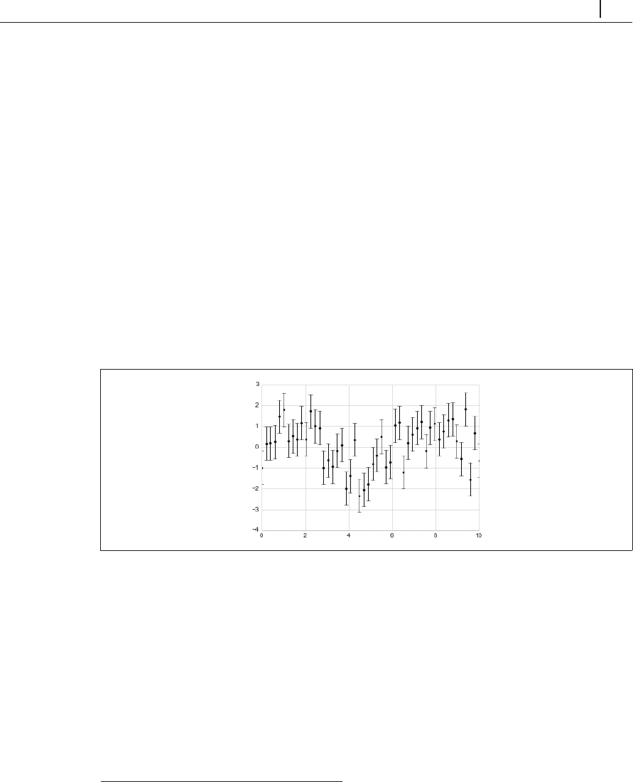
基本的なエラーバーは、
1
回の
Matplotlib
の関数呼び出しで作成できます(図 4-27)。
In[1]: %matplotlib inline
import matplotlib.pyplot as plt
plt.style.use('seaborn-whitegrid')
import numpy as np
In[2]: x = np.linspace(0, 10, 50)
dy = 0.8
y = np.sin(x) + d
y * np.random.randn(50)
plt.errorbar(x, y, yerr=dy, fmt='.k');
図4-27 エラーバーの例
fmt
は線と点の外観を制御する書式コードであり、「4.3 単純な線グラフ」および「4.4 単純な
散布図」で説明した
plt.plot
の略語と同じ値を使います。
これらの基本オプションに加えて、
errorbar
メソッドには出力を微調整するための多くのオプ
ションがあります。これらの追加オプションを使用すると、エラーバープロットの見た目を簡単に
カスタマイズできます。点そのものよりもエラーバーを明るい色にすれば、特に混雑したプロット ...