312
4
章
Matplotlib
による可視化
cmap='Reds', alpha=0.5)
# 3. create colorbar and legend 3.
カラーバーと凡例を追加
plt.colorbar(label=r'$\log_{10}({\rm population})$')
plt.clim(3, 7)
# make legend with dummy points
ダミーの点を使って凡例を作成
for a in [100, 300, 500]:
plt.scatter([], [], c='k', alpha=0.5, s=a,
label=str(a) + ' km$^2$')
plt.legend(scatterpoi
nts=1, frameon=False,
labelspacing=1, loc='lower left');
log
10
(人口)
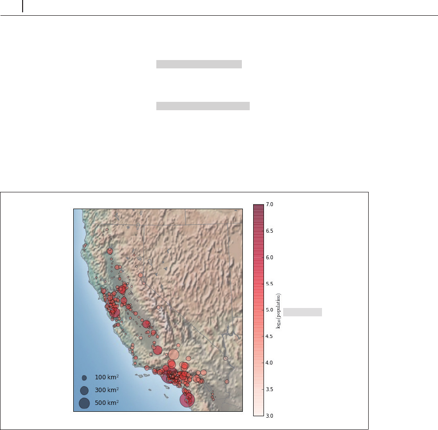
図4-109 地図上に展開した散布図
この図はカリフォルニア州の人口はどこに集まっているのかを概略的に示しています。ロサンゼ
ルスとサンフランシスコの海岸の近くに集中し、平坦なセントラル・バレーの高速道路に沿って伸
びていますが、州境に沿った山岳地帯をほぼ完全に避けています。
4.15.5
事例:地表気温データ
より連続的な地理データを可視化する例として、
2014
年
1
月に米国の東半分を覆った「極循環」
(
polar vortex
)を見てみましょう。あらゆる気候データの大きなソースの
1
つが、
NASA
のゴダード